
A solitary pendulum swing is too long a time for a modern viewer to spend at a loading webpage. Failing to notice the ever-closing gap between the screen sizes of internet-enabled devices can lead to a critical loss of essential website traffic.
Being a relatively recent concept, most people aren’t familiar with what responsive web design is.
In this blog, we will explore the advantages of hiring virtual website developers for clients based in the UK, US, and Canada, and how they contribute to creating responsive and functional websites.
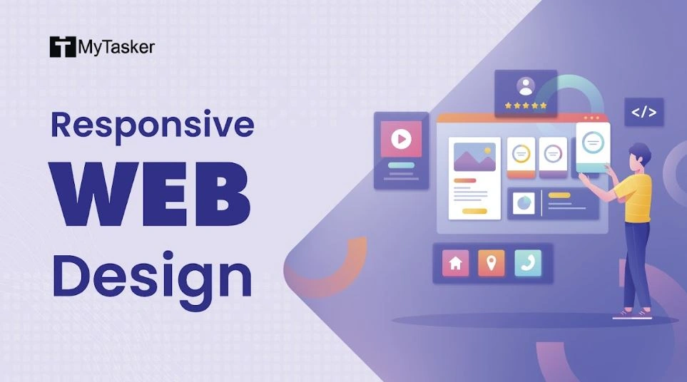
Responsive Web Design is the change in the designing approach of websites to minimize navigation, scrolling and panning while keeping the wide range of screen sizes in mind (from desktop computer monitors to smartphones). This concept looks at webpages as resizable liquid content that takes the shape of the screen; like water, which takes the shape of the container it is poured into. This is different from the usual way of designing websites—visualizing the content in terms of pixels or boxes. So basically, a RWD will adjust its content in proportion to the screen size of the viewer, thereby minimizing the need to navigate as much as a Non-Responsive Web Design.
With the increase in handheld Internet accessing units, the importance of a mobile friendly website cannot be overstated these days. Mobile and cellular devices are being favored over desktops by the crowd, and a RWD website can help tap the increasing traffic.

The major advantage of a responsive web design is that it maintains the level of visual uniformity required for a website to be taken seriously by a viewer. The very purpose of a mobile device is to view information quickly and on the go. Enabling your website to positively interact and respond with the user’s screen can increase their tolerance, thereby increasing time spent on the page.
A RWD website also helps holding the viewers captive, i.e., the users who witness perfectly liquid websites that respond to the screens on their mobile devices are less likely to bounce to other sites since they will not be subjected to mind-numbing scrolling. While countless websites have chosen to combat this problem by creating separate websites for mobiles alone, the closing gap between screen sizes in the market and an inability to categorize them under laptop or phone has led us to believe that a RWD might be a better solution.
This puts forth the question, ‘Is RWD really necessary?’
Although some might argue that one need not concern oneself with it, it is undeniable that Search Engine Optimization (SEO) is not a joke.
These liquid websites are regarded so highly that Google has begun favoring the RWD webpages on their Search Engine Result Pages (SERP)! At this stage it only makes sense to switch over to RWD websites in order to get ahead of the game.
To sum up, a RWD offers:
- Better SEO
- Better SERP
- Minimal Navigation
- Adaptability of website to all screen sizes
- Increased mobile traffic
The bottom line here is that size matters. Don’t miss out on mobile traffic because of a non-responsive web design. And here at MyTasker, we don’t intend to. Which is why both our company website and our blog is RWD!