Do you have instances when you see healthy traffic on your website; however, none of them are remotely interested to click on any of the “Call to Action” buttons on your web pages?
Today, video, audio and textual content have become of paramount importance to audiences who visit your website. Well, after all, this information allows a visitor to know more about your business and if you are capable of addressing and remedying their pain points.
That is how a visitor, searching your website, finds the solutions to his problems and ultimately, becomes a customer.
Be it audio, video, or textual content, all of these need appropriate "call to action (CTA)" as they signify the values you offer to your viewers or readers. CTAs are nothing but actionable prompters that tell the viewer what to do next.
Essentially, CTAs can help to boom your sales if you create them properly.
Well...Do you know the downside of the word “properly”? — if you don’t know how to perform the very action/task which has to be done properly, or evaluate its attributes or qualities which mark its properness, the word doesn’t serve any value...it sounds vague and lifeless.
If you don’t know how to build a website, and I only say “build your website properly”....then the word is of no help.
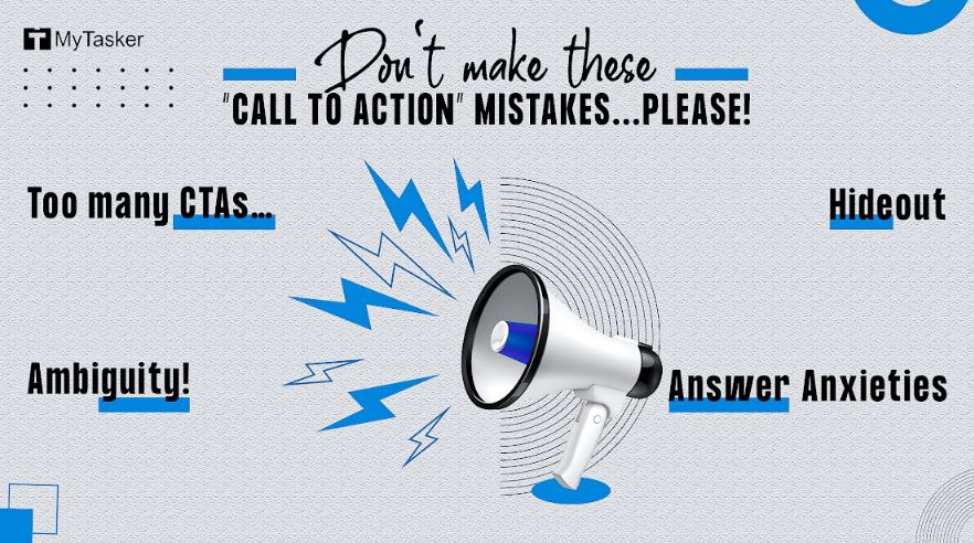
Let’s keep ambiguities at bay, and discuss the nuts and bolts (the basic practical details) of CTA placement!
Too many CTAs…
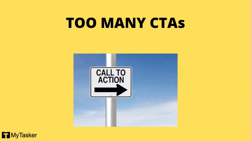
We all watch YouTube videos, and after the pandemic, we watch them more. While watching videos, you may have noticed that many times, YouTubers, with acrobatic visual effects and loud music, ask us to perform multiple tasks at the very beginning of the videos, such as share, subscribe, like, comment, press the bell. It is as if some external force is bombarding multiple tasks on you.
I still remember one lazy Sunday evening, I was lying on my bed in a “don’t-ask-me-anything” mood. Peeping through one eye, I opened a YouTube video.
After listening to these usual commands, I felt so overwhelmed that I put away my phone, pulled a blanket, and went off to sleep...that night I missed my dinner! Indeed, I was slightly indolent, but the video, though not lulled, certainly forced me to go off.
This “ask-for-too-many” strategy increases the bounce rate - people go away! In the case of videos, the viewers switch or bounce in the first 3 to 5 seconds unless the video creator is popular and well-known.
First, share some values or touch your viewers’ hearts, and only when you have managed to capture their attention, should you then ask them for anything.
Remember, a viewer is not there on the platform to give you any value (as harsh as that sounds) instead, he/she is there to derive something from you. Make it worth their while and then go ahead and ask them to do something for you, provided they’ve enjoyed their time and have got something informative.
If you use too many “CTAs” on one page, you confuse your audience. You place multiple roads before them, and they don't know which way to go!
It is the biggest content killer; it can kill your hours of effort and money like this (like what?).
Oops...You didn’t hear my finger snapping!
Let's talk about the blunder no. 2!
Ambiguity!
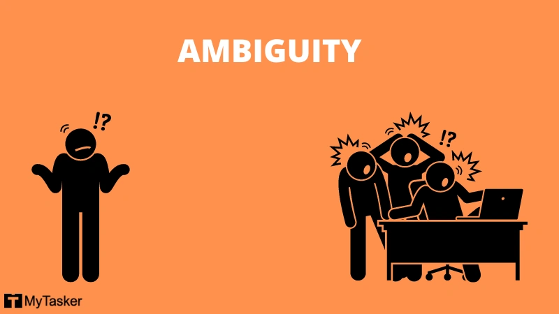
As Mars and Jupiter, there is a difference between "a build-up" and "concealment". "Ambiguity" is not a suspense thriller by Agatha Christie. It doesn't rush our adrenaline; it creates irritation and gives stress.
Keeping your audience wondering when the value will come or forcing them to enter some unknown territory, like “click here”, “buy now”, “submit now”, etc., makes your “CTA” weak and cunning.
Ask yourself, as an audience, before asking them to hit any link or button — Is there any possible objection or unanswered question!
Many people feel hesitant to use their credit cards before using any “ Free Trial”. Answer their fears, for instance, “no credit card is needed”, you won’t receive marketing calls, etc. If you charge any verification fee, mention it.
For instance, MyTasker provides an Exclusive Trial, where you can select one of our VAs, share your requirements, delegate some work to evaluate our quality of service. If you like our services, you can go ahead with our paid subscription. We charge USD 1 for this (for authenticity purposes) which you need to pay via PayPal.
Be transparent and showcase the benefits which your audience will get after hitting the call-to-action button. Your commitments and requests should be your call to action. Be creative and avoid clichés!
Joanna Wiebe (Copy Blogger) suggests we should write our “Call to Action” in the first person.
She says:
“A great rule of thumb when writing a call to action is to make your button copy complete this sentence:
I want to ________________
That little trick is how we get buttons like Find Out How to Ride a Bike and Make Sense of My Finances Fast. It’s also how we avoid buttons like Register to Learn More … because no one wants to register to learn more.”
Hideout
Sometimes, we use CTAs in such a manner that they appear similar to other content of the very page, hiding in the crowd of words.
This way, we decrease the visibility of our Call to Action and make them less compelling and action-oriented.
Joana suggests the following methods to make our “CTAs” attractive and increase their visibility.
- Use contrasting colors to make your CTA obvious, and don’t be afraid to choose a tone that’s not in your company color scheme.
- In most cases, your CTA should be big and obvious in order to draw attention to itself.
- Avoid using grey or muted colors for call to action buttons. Internet users have developed heuristics that tell us these links are dead or unclickable.
- Contrary to popular opinion, CTAs don’t need to be above the fold – but they do need to be present at the moment the customer wants to convert.
- Hyperlinks should come in a contrasting color – but be careful about deviating from the tried and tested blue shade we’ve all come to know and understand.
Answer Anxieties

Sometimes, when we create some offer, and someone doesn’t subscribe to it, we simply conclude that the person is not interested. It’s not always true. Many times, people can’t make decisions...they feel worried.
For instance, I may find your pricing feasible and have a need for your services. But it doesn’t mean I will buy straightway. I may have other questions that have nothing to do with your services. For instance, can I pay via PayPal? Whether you offer a refund or not, etc.
You can’t expect me, being one step away from clicking your call-to-action button, to visit your FAQ page to quench the thirst of my queries. Or, perhaps, a “Chat Now” button where a customer service representative will be there to answer my questions.
Get Virtual Assistant today
We accept PayPal payment. Offer a 100% refund if applied within 15 days.
A/B Test
Be it your website or landing page, A/B testing is crucial for more conversions. If you set some “call to action” buttons and find that these are not generating fruitful results, you must make some changes or use variations.
I call it a democratic way to run your marketing campaigns where traffic and results bring forth the most effective version of any program, campaign, or "CTA"!
Test, test, test...to find the very best...or bests!
Steal 21 captivating call to action examples from Neil Patel ...If you don’t steal, get inspired!
Share your thoughts and more ideas in the comment below...save time and money!