If a customer abandons a website in just a few clicks, the futility of the website is quite apparent. With so much energy spent on creating and maintaining a business website, it is only obvious that the owner would expect huge return in the market.
The energy spent on creating and maintaining a business website is an investment, with the sole return being a possible increase in the market. If you are not getting this increase you deserve, you are probably missing out on one major factor: your conversion rates.
What is conversion rate?
Conversion rates are the percentage of potential customers who take a specific action that leads to a profit. This action differs with websites, businesses, and establishments. It may be as simple as filling out a form or making an account, to making a purchase and other financial transactions. The bottom line is that your establishment must instigate a conversion.
This ‘establishment’ could be any element of your business that is built to interact with the customers; a shop, an advertisement or a website.
Apart from being a very good tracker of your business’s interaction, knowing one’s website conversion rates are important because it is highly cost effective. Consider a cluttered table. Finding what you want on it would be a tedious task. An organized table is inviting and doesn’t irritate you when you want to find what you need. This is essentially the idea associated with improving website conversion rates.
How you design your website and how it serves your customers affect the rate of conversion.
Creating voluminous websites are not the way to maximize conversion rates. You have to pay some attention to the design as well.
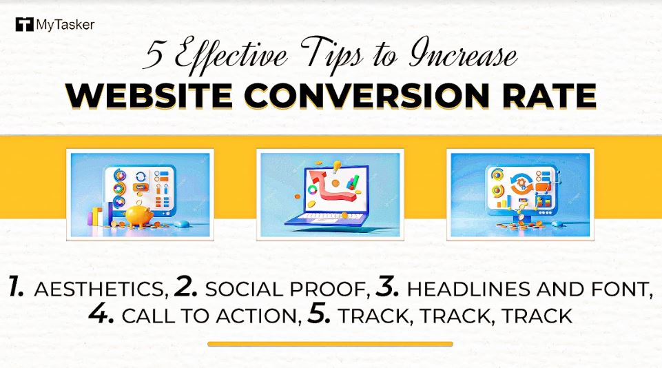
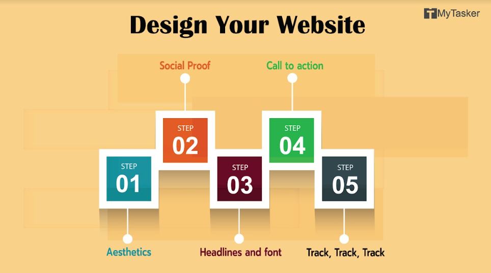
Here are 5 design tips and tricks you can use to increase website conversion rates:
1. Aesthetics:
An incredibly basic necessity for improving conversion rates. Judge your website’s aesthetic appeal and make essential changes. Fast. An uninviting website only increases bounce rates. Seek assistance from designers and artists who would create eye-catching websites that would attract the customers. Remember, a cluttered website has no aesthetic appeal. So, make your website visually appealing.
2. Social Proof:
What started as a bold display of customer feedback to show honesty has now become one of the strongest elements of marketing. This includes reviews, ratings, and testimonials on your website that entice a customer to purchase your products or services. You can also display awards won or top rated comments on the webpage to increase conversion rates.
3. Headlines and font:
The basic rule of eye movement is, ‘Big and bright attracts sight’. Outline your important headings and adjust the fonts accordingly. Highlight the important features of your website, so that no one needs to search for those.
4. Call to action:
Understand that what you’re dealing with here are clicks – the correct clicks. Lack of clarity will lead to an abrupt withdrawal. Use arrow marks or distinguishing leads that silently communicate to a customer to click. However, don’t overdo it by making it too flashy. Everyone knows: ‘All that glitters is not gold’. Point out the important icons to click that could lead to conversion. E.g.: A moving arrow saying “Click here to get started”
5. Track, Track, Track:
You cannot improve that which you cannot measure. No matter how many designing changes you make, you will get nowhere if you do not track your conversion rates. Make it a point to assess the conversion rates after every major change to your website. You will detect the highs and lows, thereby knowing the best look for your website.


