“Design is the silent ambassador of your brand” – Paul Rand
Web design can make or break the fate of your web business! Within a few seconds if you are unable to make the visitor understand the purpose of your website, then it’s time to reconsider whether the design is appealing indeed. It’s the dream of the entrepreneurs to make visitors stay on the website longer and easily persuade them to get their services and products.
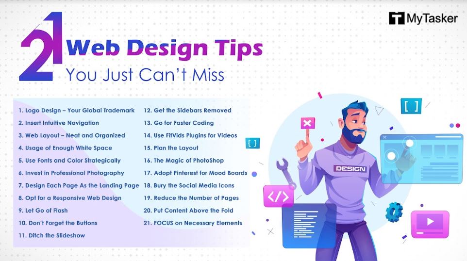
This is possible with a few valuable tips that can improve your web design and here are the 21 points given below, which are certainly going to come handy and are definitely the finest, bankable and easily applicable web design tips.
1. Logo Design – Your Global Trademark
Good art is talent and a good design is more of a skill. Designing the logo in a simple and smart fashion can really make your brand identity more recognizable. Making it unique and eye catching is the key to success. However, Martin Christie of Logo Design London says, “Check out the various logos your client has employed since their company was founded.” This tip is going to make the design have the unique tinge of artistry. Using high resolution images for your logo and featuring it at the upper left corner of the page is the thumb rule. A logo is an important part of your brand and it needs to be linked to the Homepage efficiently, so that the visitors can easily navigate it.
2. Insert Intuitive Navigation
According to a report on HubSpot survey, 76% of visitors find navigation puzzling. Primary and secondary navigation options are at times quite confusing. Visitors are impatient and won’t waste much time trying to figure anything confusing. Therefore, instead of putting links to less important pages, opt for intuitive navigation. Over here, detract links from the home or landing page, and put the “less important links and information pieces” at the bottom end of the page in the footer section. This makes things easier for the visitor and the layout also looks more organized.
3. Web Layout – Neat and Organized
A visually attractive web design is something which is neat, tidy and free of clutter. Designers make the mistake of making a web design attractive by inserting images with graphs, photographs and what not. One of the most important web design tips is to streamline the pages and keep it informative, crisp and short. Web content should not exceed more than six lines, as the content needs to be precise and “to the point.” The visitor should know, at one glance, what the site is about. Excess information clutters the vision.
4. Usage of Enough White Space
“White Space” is also considered as the breathing room for the visitors. “Less is more”, this quote stands so true in web design. With so many websites coming up and each trying to grab attention, the use of white space is neglected. Creating space between paragraphs and images, gives the visitors a space to breathe and absorb everything the website has to offer. This, in turn, improves user experience and increases return from the website.
5. Use Fonts and Color Strategically
The best web design advice you can get is to use fonts and colors in a strategic manner. Talking about the color code used in web design, it’s crucial to note that a great design needs to cater to the taste of the targeted audience; therefore, the color of the background and fonts need to be tailored and monitored for attracting the targeted clients. A white colored background with light pastel shades shows elegance and sophistication, whereas the use of vivid colors will go well with a site targeting the kids. On a similar note, it is crucial to select fonts which are easier to read across all devices and browsers.
6. Invest in Professional Photography
Visitors can easily make out any edited picture you have taken from the web and pasted on the site as your own. This leaves a very generic impression and it is reflected on your company’s brand image. Investing in professional photography is a wonderful option, as it is eye-catching and succeeds in developing an emotional connection between the content and the images and the visitors find such stuff truly engaging.
7. Design Each Page As the Landing Page
The traditional web designer designs a website assuming the user enters through the home page and then navigates into the site. In reality, this does not happen. However, most of the visits begins on a page, which is actually “not the home page”. So, each and every page of the website needs to be designed impressively with every bit of information, as each page needs to be potentially powerful as the landing page to grab the attention of the visitor and convert the person into a potential consumer.
8. Opt for a Responsive Web Design
With the advent of smartphones, the need for a responsive website is on the rise. It has a futuristic value and added to it is the user experience, which is simply great. Since more number of people are now using smartphone devices, the reasons for supporting a responsive web design are truly worthy ones, as it ultimately ensures the websites success.
9. Let Go of Flash
Bid adieu to Flash, as with dispute going on between Adobe and Apple, the designers are opting for other options to bank upon that are much more web and user friendlier, than Flash. “HTML5” have now come up and gaining more support and preference on the web with search engine friendly text and the ability to function on popular mobile operating devices without the need of a plugin. Such things are absent in Flash. So, it’s time to drop Flash and go in search of other better options.
10. Don’t Forget the Buttons
The ugly and unimpressive submit or send button at the bottom of the webpage is the most adverse point for many visitors. It is recommended to create form submission buttons appealing enough to entice the visitors to “click”. This can be done, if the designer gets creative and makes the submit button change color, gradient, opacity or font treatment. The button should be striking and appealing to grab attention.
11. Ditch the Slideshow
The slideshow was introduced long ago on the website to provide information right at the first page of the website. However, the impatient visitors do not have much time to stay on the first page of the site and experience the visual messages. The key solution is to keep the messages short, sweet and simple. Create an image along with a message, the website prioritizes and the visitor understands this short message in a jiffy. Promoting your message in a short and simple manner is the best designing approach to make your web design rock.
12. Get the Sidebars Removed
Research has proven that removing sidebars from the company blog has increased the number of clicks over 35%. This is because it encourages the reader to be more attentive to the article and the call for action from the visitors’ end gets enhanced. Tried, tested and proven – so remove the sidebars now!
13. Go for Faster Coding
Opt for CodeKit for browser reloading. It instantly enables to see any changes in the browser, without the need for refreshing. This is like a steroid for web developers and implementing it along with design, can ease the pressure of the web designer. With a great coding technique used, the designs ought to come out fabulously great and the appeal of the website increases manifold.
14. Use FitVids Plugins for Videos
Incorporating a video to your website can make the web pages look damn innovative and informative in an interesting format. With the use of a lightweight, easy to use jQuery plugin, the videos attain fluidity and a responsive capacity. Known as FitVids, this plugin supports video vendors like YouTube, Vimeo, Blip.tv and a couple others.
15. Plan the Layout
Planning is crucial in order to get a web design success story. The layout of the website needs to be planned strategically. No two companies or brands are the same. So, it’s important to create a design “different and distinctive” from all others, even if the target audience is the same. This means although the essence of the design is similar, but the outlook of the brand needs to be strikingly different from all aspects.
16. The Magic of PhotoShop
In order to have a wonderful web design, it’s essential to be descriptive for naming the Photoshop layers. Rhys Little offers a few tips on the layout of Photoshop, “Be as descriptive as possible when you name your Photoshop layers. It takes a second when creating a new layer to give it a simple name that others will be able to understand.” This tip saves the designer for investing on hours of forensic work later on. Furthermore, he adds, “Throw away the extra layers in Photoshop designs.”- this is done to minimize confusion. Technically, Photoshop is an application used to modify images, but it’s richly packed with tools for developing graphical layouts from scratch. If it’s done properly, the result can be outstanding!
17. Adopt Pinterest for Mood Boards
When putting inspiration and ideas together for a website, you are redesigning a section of your website. It is necessary to collect information from one place and keep it as a future reference from where your inspiration generated. Pinterest can be used to create mood boards for images, colors, layout and other concept material which the designers find to be useful for future reference. Another utility, it that other designers also create and share mood boards and their ton of resources can be used by all, as a valuable support source.
18. Bury the Social Media Icons
With a great design, you attract visitors to your website, but by placing social media icons in a prominent location, you instigate them to leave. Never place social media icons anywhere near the header. Bury them all in the footer. It’s a thumb rule. Social media sends people to the website, not vice versa.
19. Reduce the Number of Pages
Trimming down the page count has a lot to do with making your web design interesting and at the same time the navigation gets simpler and easier. Having too many menu items can be confusing and make the visitors overwhelmed by the choices. Minimal number of pages make the website more inviting and friendlier to the visitors.
20. Put Content Above the Fold
Studies have proved that the majority of the people spends more time focusing above the fold on web pages, that is, what shows up on the screen without actually scrolling down. Therefore, designers tend to make the mistake of putting everything at the header section, which makes the entire thing look clumsy. Things can be improved by changing the header’s “height” as required and keeping the sign-up button higher up on the page, to grab the visitor’s attention. After all, the desired, “call-to-action” is definitely the priority of the website.
21. FOCUS on Necessary Elements
This is one of the most common tips web designers are asked to follow, but still at times the focus of the website is not clear. Unnecessary elements clutter and confuse. Use the 80-20 rule to trim down website elements to the essentials. Chris Pearson, the creator of the popular Thesis WordPress theme Framework, agrees that this strategy actually helped to increase sales on his website.
As Steve Jobs said, “Design is not what it looks like and feels like. Design is how it works.” This is the actual secret of getting the perfect web design for your online venture. Visual appeal is secondary, attracting the potential consumer is the priority!


