In the age of digitization, businesses need to have eye catching and appealing websites for attracting the target audience.
But, what would be an influential way to embrace such appealing effect?
Well, try-out parallax designs and bring it on!
Now, what is a parallax website?
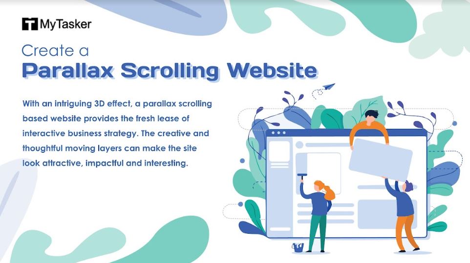
With an intriguing 3D effect, a parallax scrolling based website provides the fresh lease of interactive business strategy. The creative and thoughtful moving layers can make the site look attractive, impactful and interesting.
The background moves at different speeds like the rest part of the page, which in turn creates an outstanding and captivating visual effect. This kind of a web design is ideal to keep the visitors engaged for the maximum time possible and the big brands have also developed a liking towards this popular website design trend.
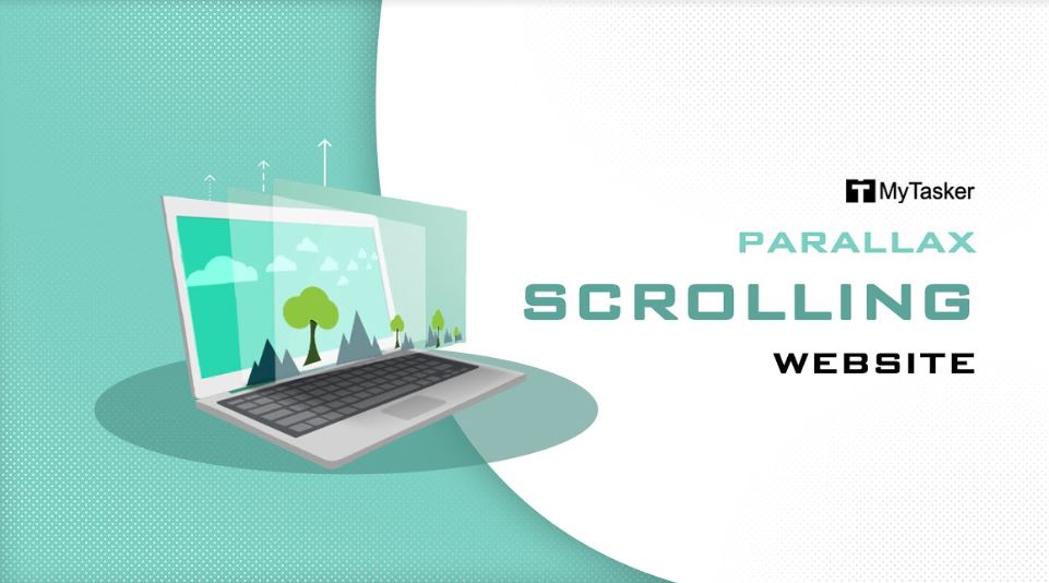
Derived from the Greek term “Parallàxis”, Parallax scrolling is a technique used in computer graphics or web design where the background images move slower than foreground images, thus creating an illusion of depth and immersion.
It can be overwhelming to create a perfect masterpiece, so the tips below will come of immense utility to create the impeccable parallax scrolling website.
It can be overwhelming to create a perfect masterpiece, so the tips below will come of immense utility to create the impeccable parallax scrolling website.
Select the style for your website
There are four methods which can be used to create an engaging parallax web design.
- With multiple backgrounds moving in an independent direction, horizontally or vertically, the Layered Method is a good option.
- The usage of one large image comprising of multiple images is a great one, as it displays only the parts of the said image when positioned differently. This Sprite Method is hugely popular for its effect on the navigation menus.
- With the Repeating Pattern Method, scrolling displays the building up of individual tiles which can be made to float over a repeating background layer.
- Lastly, with the Raster Method, pixel lines of an image are refreshed in top-to-bottom order with slight delays in drawing one line and the next.
After discussing the layout, it’s important to check out the entire process of designing a parallax website, which will engage the visitors’ and sway their interests in getting converted into regular clients of the brand.
Let’s dig in and check out a captivating webpage can be designed using the parallax method.
The parallax intro
One of the most popular scroll animation in the contemporary times, a parallax scrolling website has a huge fixed image spread across the background. However, only a small portion of it can be seen depending on how far it’s scrolled. With some smart CSS work, such a type of website can be made amazingly impactful.
On a parallax scrolling website, there are three inline paragraphs appearing one after the other. With the use of offsets, it’s accomplished to make the animation start off earlier than it generally should. This makes the visuals more stunning and stimulating.
The impactful feature listing
Feature lists are the places from where you can project and showcase what your products are capable of. Big animated icons and texts are a must have thing to spice up the services and the products.
Features appearing from different sides of the screen are the widely used design of parallax scrolling and make the impact more intense.
The About Us and gallery pages
A beautiful scroll animation for the gallery can be engaging and captivating enough with images on the rows moving in opposite directions, to grab the attention of the viewers. Such visual effects go a long way in making your site look amazingly wonderful.
One of the main USP of parallax scrolling websites is its marvelous visual delights, which is bound to make the visitor pause and have a look. This is an important factor to develop interest and convert visitors into potential consumers and then into regular clients.
The footer section
Freebie templates can make the footer section look more interesting and incredibly fascinating. After scrolling down, when the footer section enters the screen, the search bar inside it increases, making a dynamic call for action impact on the visitor’s mind.
Guidance Tutorials all the way…
If you are still a bit in jitters about how to make a parallax scrolling website, then an online tutorial guidance can be of immense help. Although the skills and expertise of a professional are required to create a parallax website, guidance tutorials are always helpful in providing helpful tips for developing a wonderful website.
Points to remember about parallax website:
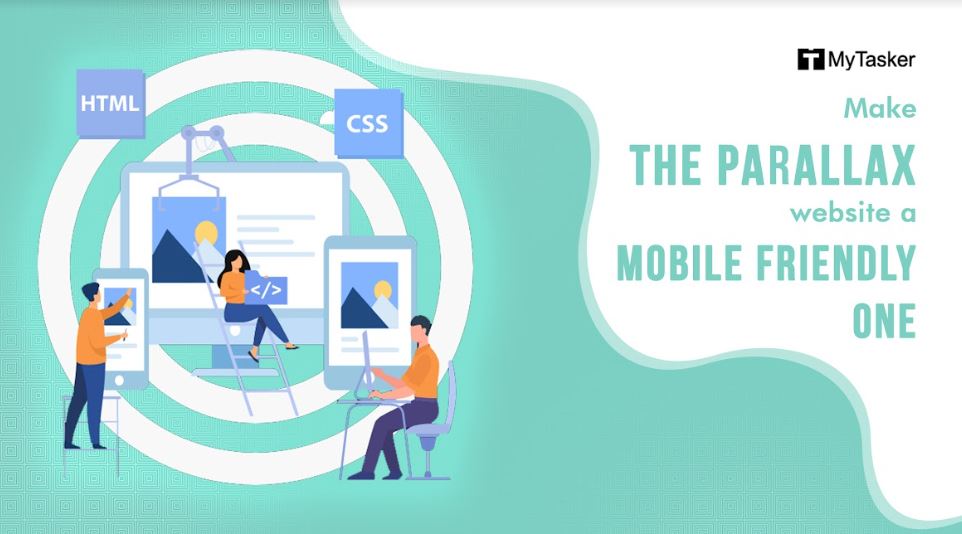
- Make the parallax website a mobile friendly one. Opting for a responsive design is going to get you accolades and make the online venture a success story.
- Parallax scrolling is a very cool web technology, but using it unnecessarily can spoil the fun element.
- Scrolling down a website can be made interesting, if you decide to tell the visitor about your business story. Engaging and highly enriching, it’s a fun way to make your website look impactful.
- Harness call for action. The “next button” and “shop now” guide the visitors’ and entice them to take initiative and call for action.
- Parallax is about the illusion of depth. So, experiment with it and with perfect layering with depth, the illustrative webpage surely looks classic and worthy.
- Never overdo with parallax designing, or else the visitors will be blinded by its beauty, without having proper understanding about the website!
- Don’t forget cross browser testing for parallax websites.
So, if you are wondering how to make a parallax website, then the above-mentioned points will surely make the picture and concept crystal clear. Nevertheless, the need for a professional cannot be ignored for creating a perfect parallax scrolling website.
“The first impression is definitely the last impression.”
Therefore, if you are looking to impress the visitors’ and have a lasting impact on their minds, then this web design is a perfect choice, catering to your needs to grab the immediate attention of the online browsers.


